Correlation#
Notebook created for Regression in Psychology PSYCH–GA.2229 graduate level course at New York University by Dr. Madalina Vlasceanu
This content is Open Access (free access to information and unrestricted use of electronic resources for everyone).
Sources: Navarro, D. (2013). Learning statistics with R: https://learningstatisticswithr.com/
What is correlation?#
Correlation is a statistical measure that expresses the extent to which two variables are linearly related (meaning they change together at a constant rate). That is, a correlation captures the association between 2 variables.
Example: Is my sleep associated / correlated with my grumpiness? Yes, the more I sleep, the less grumpy I am. Thus, the correlation between sleep and grumpiness is negative.
Correlation coefficient#
The correlation coefficient caputers the magnitude and the direction (positive or negative) of the correlation.
Varies from –1 to 1
r = –1 it means there is a perfect negative relationship
r = 1 it means there is a perfect positive relationship
r = 0, there is no relationship at all
How is the correlation coefficient calculated?
The covariance between two variables X and Y is a generalization of the notion of the variance; it’s a mathematically simple way of describing the relationship between two variables.
The Pearson correlation measures the strength of the linear relationship between two variables.
The Pearson correlation coefficient r standardizes the covariance, in the same way the z-score standardizes a raw score: by dividing by the standard deviation.
How about non-contunous variables?#
The Spearman’s rank correlation measures the correlation between non-continuous variables.
Let’s practice running correlations#
# import libraries

import pandas as pd
from scipy import stats
import seaborn as sns
import numpy as np
import matplotlib.pyplot as plt
# import data downloaded from https://github.com/mvlasceanu/RegressionData/blob/main/data.xlsx
#df = pd.read_excel('data.xlsx')

# Or you can read the Excel file directly from the URL
url = 'https://github.com/mvlasceanu/RegressionData/raw/main/data.xlsx'
df = pd.read_excel(url)

df.head(2)
| Response ID | GENDER | AGE | PARTY | TRUST | RU1 | RU2 | RU3 | RU4 | ... | Post23 | Post24 | Post25 | Post26 | Post27 | Post28 | Post29 | Post30 | Post31 | Post32 | ||
|---|---|---|---|---|---|---|---|---|---|---|---|---|---|---|---|---|---|---|---|---|---|
| 0 | R_0cj5dsJg2wfpiuJ | 1 | 18 | 1 | 0 | 95 | 4.0 | 26 | 0 | -5 | ... | 69 | 60 | 20 | 58 | 84 | 22 | 42 | 77 | 90 | 71 |
| 1 | R_0rkhLjwWPHHjnTX | 0 | 19 | 2 | 1 | 76 | -5.0 | 16 | 3 | -1 | ... | 58 | 82 | 38 | 61 | 36 | 40 | 62 | 68 | 46 | 43 |
2 rows × 102 columns
# corelate trust in science with age
# Run a Pearson Correlation for continuous variables
# the first output is the correlation coefficient r
# the second output is the p-value significance level

stats.pearsonr(df.AGE, df.TRUST)
PearsonRResult(statistic=0.012687557785958276, pvalue=0.8584782150756923)
# Run a Spearman Correlation for rank variables
stats.spearmanr(df.AGE, df.TRUST)
SignificanceResult(statistic=0.0248282977917326, pvalue=0.7271057552670346)
Plots#
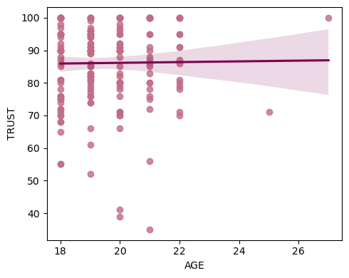
# Make a simple regression plot

# Create the figure
fig, ax = plt.subplots(1,1, figsize=(5,4))

# Plot the line
sns.regplot(x=df.AGE, y=df.TRUST, scatter_kws={"color": "#C06C84"}, line_kws={"color":"#7D0552"}, ax=ax)

# Include this command such that all the elements of the plot appear in the figure
plt.tight_layout()

# Save figure
plt.savefig('figure.tif', dpi=300, format="tiff")
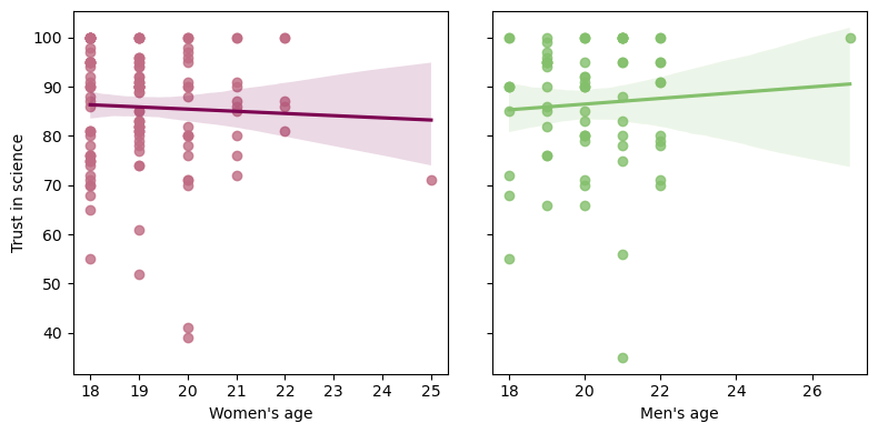
# Create the figure with 2 panels that share the y axis
fig, ax = plt.subplots(1,2, figsize=(8,4), sharey=True)

# Plot the line of women's age against their trust in science
sns.regplot(x=df.query('GENDER==1')['AGE'], y=df.query('GENDER==1')['TRUST'], scatter_kws={"color": "#C06C84"}, line_kws={"color":"#7D0552"}, ax=ax[0])

# Plot the line of men's age against their trust in science
sns.regplot(x=df.query('GENDER==0')['AGE'], y=df.query('GENDER==0')['TRUST'], scatter_kws={"color": "#84C06C"}, line_kws={"color":"#84C06C"}, ax=ax[1])

# label the x axis
ax[0].set_xlabel("Women's age")
ax[1].set_xlabel("Men's age")

# label the y axis
ax[0].set_ylabel("Trust in science")
ax[1].set_ylabel(" ")

# Include this command such that all the elements of the plot appear in the figure
plt.tight_layout()

# Save figure
plt.savefig('figure.tif', dpi=300, format="tiff")
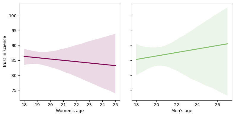
Let’s recreate the figure above but remove the scatter dots
# Create the figure with 2 panels that share the y axis
fig, ax = plt.subplots(1,2, figsize=(8,4), sharey=True)

# Plot the line of women's age against their trust in science
sns.regplot(x=df.query('GENDER==1')['AGE'], y=df.query('GENDER==1')['TRUST'], scatter=False, line_kws={"color":"#7D0552"}, ax=ax[0])

# Plot the line of men's age against their trust in science
sns.regplot(x=df.query('GENDER==0')['AGE'], y=df.query('GENDER==0')['TRUST'], scatter=False, line_kws={"color":"#84C06C"}, ax=ax[1])

# label the x axis
ax[0].set_xlabel("Women's age")
ax[1].set_xlabel("Men's age")

# label the y axis
ax[0].set_ylabel("Trust in science")
ax[1].set_ylabel(" ")

# Include this command such that all the elements of the plot appear in the figure
plt.tight_layout()

# Save figure
plt.savefig('figure.tif', dpi=300, format="tiff")
Another example#
# import data downloaded from https://github.com/mvlasceanu/RegressionData/blob/da060297aea7dccb040a16be2a744b3310a3f948/data.csv
# df = pd.read_excel('data.xlsx')

# Or you can read the Excel file directly from the URL
url = 'https://github.com/mvlasceanu/RegressionData/raw/da060297aea7dccb040a16be2a744b3310a3f948/data.csv'
df = pd.read_csv(url)
df.head(2)
| ResponseId | condName | BELIEFcc | POLICYcc | SHAREcc | WEPTcc | Intervention_order | Belief1 | Belief2 | Belief3 | ... | Age | Politics2_1 | Politics2_9 | Edu | Income | Indirect_SES | MacArthur_SES | PerceivedSciConsensu_1 | Intro_Timer | condition_time_total | |
|---|---|---|---|---|---|---|---|---|---|---|---|---|---|---|---|---|---|---|---|---|---|
| 0 | R_1d6rdZRmlD02sFi | FutureSelfCont | 100.0 | 100.0 | 0.0 | 8 | PolicySocialM | 100 | 100 | 100 | ... | 40 | 100.0 | NaN | 2.0 | 1.0 | 2,3,4,6,7 | 7 | 81 | 25.566 | 1043.866 |
| 1 | R_1CjFxfgjU1coLqp | Control | 100.0 | 100.0 | 0.0 | 1 | PolicySocialM | 100 | 100 | 100 | ... | 50 | 3.0 | 5.0 | 4.0 | NaN | 1,3,4,5,6,7 | 9 | 96 | 16.697 | 367.657 |
2 rows × 51 columns
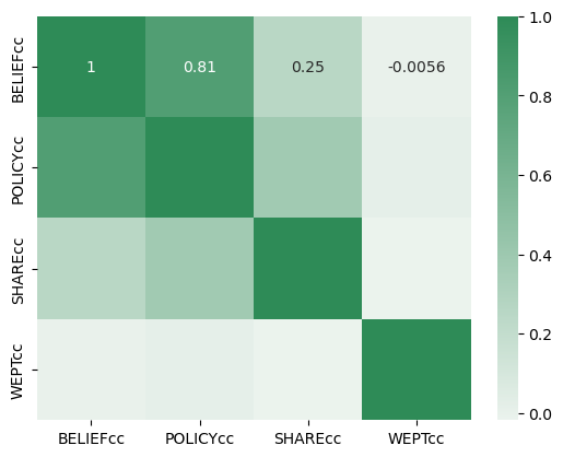
# get the correlation matrix of the 4 outcome variables: beliefs, policy support, sharing intentions, and trees planted

df[["BELIEFcc", "POLICYcc", "SHAREcc", "WEPTcc"]].corr()
| BELIEFcc | POLICYcc | SHAREcc | WEPTcc | |
|---|---|---|---|---|
| BELIEFcc | 1.000000 | 0.810957 | 0.253270 | -0.005551 |
| POLICYcc | 0.810957 | 1.000000 | 0.381650 | 0.016097 |
| SHAREcc | 0.253270 | 0.381650 | 1.000000 | -0.018039 |
| WEPTcc | -0.005551 | 0.016097 | -0.018039 | 1.000000 |
# create a color pallette
color = sns.light_palette("seagreen", as_cmap=True)

# plot a heatmap of the correlation matrix created above
sns.heatmap(df[["BELIEFcc", "POLICYcc", "SHAREcc", "WEPTcc"]].corr(), cmap=color, annot=True)
<Axes: >
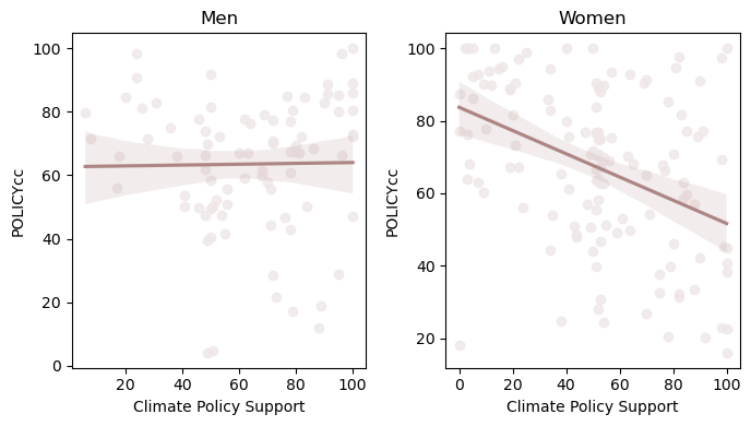
# plot the linear relationship between ideological conservatism and climate policy support, for men and women

fig, ax = plt.subplots(1,2, figsize=(7,4))

sns.regplot(x='Politics2_1', y='POLICYcc', data=df.query('Gender == 1') , scatter_kws={"color": "#EFE7E7"}, line_kws={"color":"#AD8585"}, ax=ax[0])
sns.regplot(x='Politics2_1', y='POLICYcc', data=df.query('Gender == 2') , scatter_kws={"color": "#EFE7E7"}, line_kws={"color":"#AD8585"}, ax=ax[1])

ax[0].set_xlabel('Conservativism')
ax[1].set_xlabel('Conservativism')

ax[0].set_xlabel('Climate Policy Support')
ax[1].set_xlabel('Climate Policy Support')

ax[0].set_title( "Men" , size = 12 )
ax[1].set_title( "Women" , size = 12 )

plt.tight_layout()
colors = ["#2E86C1", "#CD5C5C"]

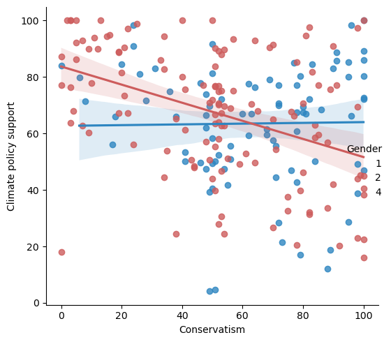
sns.lmplot(x='Politics2_1', y='POLICYcc', hue='Gender', data=df, palette=colors)

plt.ylabel('Climate policy support')
plt.xlabel('Conservatism')

plt.tight_layout()
Correlation power analysis#
Compute power: WebPower: https://webpower.psychstat.org/wiki/models/index
Posthoc: after you ran the study, you want to see how much power you had, given:
what sample size you collected was
What correlation coefficient you observed was
How many other variables you controlled for
What was the p-value
Leave “power” field empty (that’s what you want to compute)
A priori: before you run the study, you want to see what sample size you need to detect a power of at least (Typically 0.8):
leave the sample size field open, that’s what you want to calculate
say what’s the minimum correlation you want to detect?
How many vars are you controlling for?
At what sig level?
How much power do you want?
In you paper, you would say: “For a power analysis we used the software webpower (Zhang & Yuan, 2018), and we calculated that in order to detect a correlation of at least r=0.1, at a significance level of 0.05, in a two sided comparison, with a power of 0.95, we need a sample size of 1293 observations (participants).”
Citation for webpower: Zhang, Z., & Yuan, K.-H. (2018). Practical Statistical Power Analysis Using Webpower and R (Eds). Granger, IN: ISDSA Press.
